

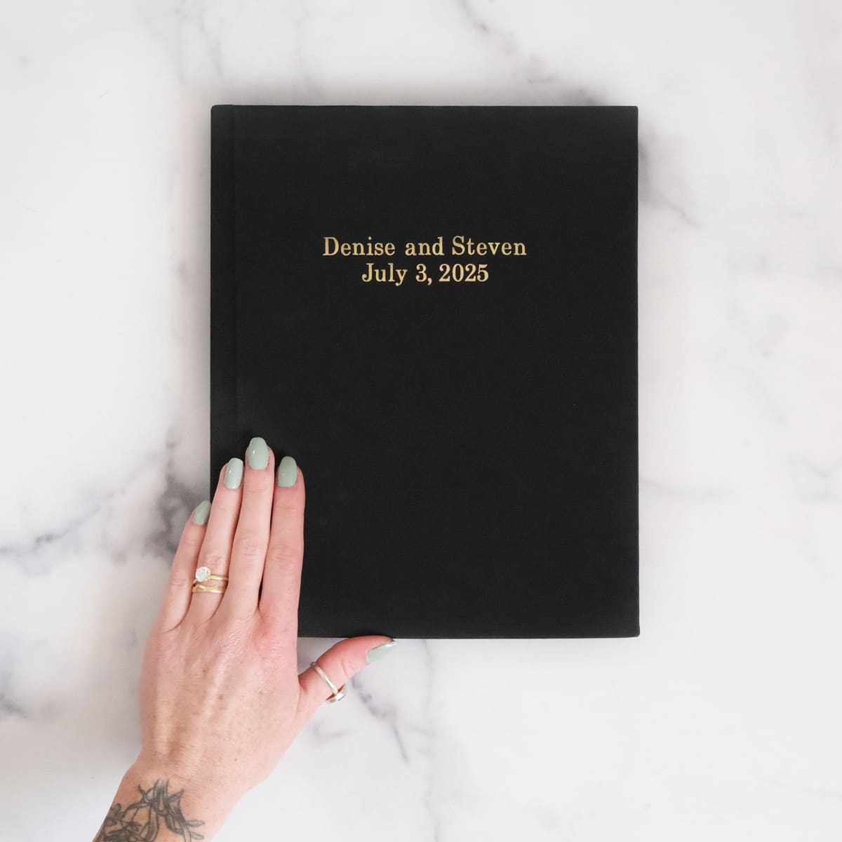

Most couples put their names and wedding date on the cover of their guest book, and that's a perfectly good choice.
But you've got more room than you think — especially if your book offers three lines of custom text — and the cover is one of those small decisions that can quietly make the whole thing feel more like yours.
The most popular formats are Name + Name with the date below, but some of the best guest books we've printed had something a little less expected on the front.
The Classic Formula (And Why It Works)
Let's start with the obvious one, because it's obvious for a reason. The vast majority of guest books we print — probably 8 out of 10 — use some version of this:
Line 1: Sarah & James
Line 2: October 14, 2026
Line 3: Napa Valley, California
Name, date, place. It's clean, it's timeless, and twenty years from now when this book is sitting on your shelf between a stack of novels and a candle you forgot to throw away, anyone who picks it up immediately knows what it is. There's real value in that simplicity — this isn't the place to overthink things if you don't want to.
Some couples swap the order around — date on top, names in the middle, location as a smaller line at the bottom. Others drop the location entirely and go with just two lines. All of these work. The format matters less than making sure the foil stamping is legible and balanced on the cover, which mostly comes down to not cramming too many characters onto a single line.
Going Beyond Names and Dates
Here's where it gets more interesting. That third line — if your guest book offers one — is a chance to do something that actually says something about your relationship. A lot of couples don't realize they have that creative real estate until they're staring at the customization form, and then they default to the city name because they're ordering at 11pm and the wedding is in three weeks.
But that third line is a gift if you use it well.
Some of the most memorable covers we've printed:
- A phrase that means something to you both. Not a generic quote — something specific. We've seen "Finally." on a guest book for a couple that dated for eleven years...one couple just put "The Long Way Round" because they'd traveled to 30 countries together before settling down. Nobody else needs to get the reference. That's kind of the point.
- The name of the venue or estate. If you're getting married somewhere with a beautiful name — a vineyard, a historic property, a family ranch — putting that on the cover ties the book to the place in a way that a city name doesn't. "Holman Ranch" hits different than "Carmel, CA."
- "Our Wedding" or "Our Guest Book" in a different language. If one or both of you have family roots in another language, this is a subtle nod that feels personal without being complicated. "Notre Mariage" or "Il Nostro Matrimonio" — it adds character and your guests will notice.
- Your wedding hashtag. This is polarizing and honestly - probably just don't do it.
- A date written out longhand. "The Fifth of October, Two Thousand Twenty-Six" across two or three lines has a different weight than "10.5.2026." It's more formal, a little old-fashioned, and it fills the cover beautifully.

How to Think About Three Lines of Text
Most guest book companies give you two lines of foil-stamped text on the cover. That's enough for names and a date, and then you're done — you've used your space. Some, including ours at Social Print Studio, offer three lines, which changes the math a bit. Three lines means you can do names and a date and still have room for a location, a phrase, or something personal.
Think of it like a hierarchy:
Line 1 (the anchor): Almost always your names. This is the biggest visual element and the first thing anyone reads. Keep it relatively short — first names work better than full names here because they're more intimate and they look better in foil at a readable size.
Line 2 (the context): Usually the date. Written numerically (10.14.2026) feels modern; written with the month spelled out (October 14, 2026) feels classic. Either way, this grounds the book in a specific moment.
Line 3 (the personality): This is the one most people leave on the table. It can be the location, but it can also be something that makes this guest book unmistakably yours and not just any couple's book with names swapped out. That's the line where you get to have a little fun with it.
If you're only working with two lines, the strongest combination is usually names + date. If you want the location, you can format it as a smaller subtitle under the date on the same line — something like "October 14, 2026 · Napa Valley" — though that depends on how your particular book handles text spacing.
Formatting Tips That Actually Matter
The cover text is going to be foil-stamped, which means it's physically pressed into the linen or material. A few things worth keeping in mind:
- Shorter lines look better. "Sarah & James" reads cleaner in foil than "Sarah Elizabeth & James Robert." If you want full names, you can — but know that the font size will shrink to accommodate them, and on a book cover you want the text to have presence, not just be readable.
- Ampersands over "and." This is partly aesthetic — the & symbol just looks better in foil stamping — and partly practical, since it saves characters. "Sarah & James" vs "Sarah and James" is a small difference that compounds when you're working with limited space.
- Be careful with special characters. Hearts, emojis, and unusual symbols are not usually available in the foil stamping font. Check what your printer supports before you get attached to the idea of a tiny mountain icon between your names.
- ALL CAPS vs. Mixed Case is a real choice. All caps gives you a more formal, engraved feel. Mixed case is warmer and more personal. Neither is wrong — it depends on whether your wedding vibe is "estate vineyard" or "backyard under the string lights." Both are great weddings, they just want different typography.

What Other Guests Will Write Inside
This is a slight tangent but it's related — the cover sets the tone for what guests write on the pages inside. A guest book with a formal, traditional cover ("Mr. & Mrs. James Whitfield, November 2026") might get more formal messages inside. A guest book with something playful or personal on the cover ("Jake & Liv — Finally.") gives guests permission to be themselves, and those messages end up being the ones you actually want to read at midnight on your anniversary.
The cover is doing more work than you think. If you want heartfelt, funny, real notes — and honestly, those are the ones worth keeping — a cover with some personality invites that energy in.
Our Honest Recommendation
If you're staring at the customization form right now and overthinking this: go with first names, the date, and one thing that makes it yours. The location if you love the venue. A word or phrase if you have one. Your family's language if it feels right.
Don't stress about it being perfect — stress about ordering it with enough lead time that it arrives before the wedding. The cover text is the part you'll decide in five minutes and love for fifty years, because it's your names and your date on a book full of messages from the people who showed up for you. That's the whole thing, really. The rest is just typography.
